chase freedom
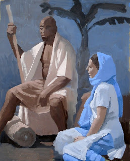
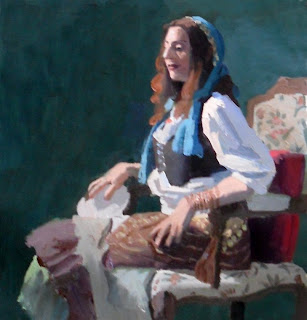
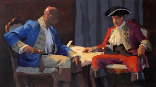
I don't know where this came from, but I've been getting ideas and I'm trying to go with them, realize them without mental censoring. Here's a brainstorm for a bank ad lol...
cannibal flower
Last night was the 9th anniversary show for Cannibal Flower. It was in a great warehouse space, but boy was it HOT! Here's a quick drawing I did in my sketchbook trying to capture a few of the people who were there. I will always enjoy improvising composition, especially on the spot!
live at lunch
Here is me, Nathan Cartwright, and Richard McDowell shooting the shit over lunch. It was streamed live, but here is the re-play...
white house
here's a new painting. I've been feeling very experimental in terms of process and subject matter lately, I'm having fun! there's been an evolution to this piece, but here's how it turned out. it's my latest toss-up... acrylic, collage, and dirt on canvas, 30 by 40
thinking about light and paint again...
Paint is paint. You can paint a wall, paint a sign, paint a car. The majority of the time, paint is used to cover a thing with a flat color. But like I said earlier, you can also use paint to create the effect of chiaroscuro, which is the illusion of light on form, and creating this effect is very logical. Now, I want to state here that while creating the illusion of chiaroscuro is very straightforward and frankly mathematical and can be expressed and understood fairly quickly and easily, truly understanding the "art" of painting is a personal journey that will take sometimes more than the artists' lifetime to master. That's how Vincent can say "painting is like algebra" and at the same time also speak about it's mysteries...
So back to the logical side of things. As I said in my earlier post, the effect of chiaroscuro is about painting two different "keys" of the same relationship of local colors, one light in value and one dark in value. What is interesting is how flexible the artist can be in expressing the "feeling" of a certain local color relationship. For example the "feeling" of the difference in value and color between, say, a white shirt, a skin tone, a red vest, and blue jeans, can be all over the place in terms of how light or dark or even overall hue (blue or orange or any color) I tried to make a new chart that further clarifies my thoughts on the idea. Sometimes images succeed when words fail.
master copy
Art Center is on break for three weeks! But I'm still teaching. Today I had a student come by who wanted a painting lesson. I don't normally do that, but last term was so frazzled since I was filling in for another teacher who had a heart attack, that I felt like I owed him (and frankly all the students in last term's class) So we decided to both do a master copy, it's always a good way to practice seeing and painting values... He picked a painting by Moroni and we went for it. It's a very simple composition and a very limited palette. We started with a monochrome acrylic underpainting and then painted in oil on top with a limited palette of White, Yellow Ochre, Burnt Sienna, Venetian Red, Mars Violet Deep, Burnt Umber, and Blue Black. I liked how mine came out so I thought I'd post this detail of the painting to my blog.
Altered Journals class begins Oct. 6th!
Hi Guys,
Hope to see you there!
My Altered Journals class at Joggles is set to begin October 6th and registration is open now. This is a fun self paced class, great for anyone new to the properties of acrylic paint!
Here's the link: http://www.joggles.com/store/catalog/index.php?cPath=75_873
Hope to see you there!
drawing on LPTV
It's not some crazy drug, it's Let's Paint TV! Whenever I get to be on the show, I always try to make some art along with the craziness... here's a couple drawings from some past episodes...
worm drawing
This morning I found a drawing in the dirt floor of my studio done by a worm the night before. I think it's a pretty nice contour drawing of a cat head! ahahahah!!
Chiaroscuro
I think a lot about what representational painting is in order to explain it to my students at the Art Center. For a long time in my mind I've tried to work out a "grand unified theory" of color but have never seemed to be able to tie all the ends together into a neat package. Lately however I feel like I've gotten closer than ever. One quote that has always surprised and fascinated me is by van Gogh, "And then I do not know how you will handle your colors, but that matters little. Just continue on: there is no better education than painting outdoors; you must always compare things thoroughly with one another, especially in tone. Painting is like algebra; that is to that as that is to that." I've always found that curious, the 'wild man from Arles' comparing painting to algebra of all things?!? But now I think I'm starting to know what he's talking about... Creating the effect of light and shadow, or chiaroscuro, is a very specific thing the artist is doing with paint. Let me see if I can explain it. Things in the world have a certain actual lightness or darkness to their surface, or "local color". Things can't be whiter than white or blacker than black. The artist only has from white to black (and the range of greys in between) to work with. The artist might be making a painting of a person with a white shirt, fair skin, red vest, and blue jeans... four colors of things that in actuality range in value (or tone) from nearly white to nearly black. They have a certain relationship to each other in terms of value and hue (color) When the artist is creating the effect of chiaroscuro, they are creating two different 'keys' of the same relationship of those four local colors, one in an 'upper' or lighter register (chiaro) and one in a lower or darker register (scuro). When these two sets of local color relationships are placed next to each other, the effect to the viewer is the inescapable appearance of light on form. It's very logical or as Vincent calls it, algebraic. CLICK HERE FOR RELATED LINK
Sistine Chapel Street Painting in London
Stats:
It took 9 artists and 1,793 sticks of chalk pastel 6 days to create Canada's largest chalk street painting.
Assisted by 11 local high school students from Oakridge and Saunders Secondary schools and 1 teacher (Oakridge)
We created an 18 x 92 foot carpet of soft pastel illustrating the 9 stories from the book of Genesis from the Central Panels of the Sistine Chapel Ceiling.
Over 500 man hours from start to finish.
The Deluge panel , depicting the great flood and painted by the amazing Genna Panzarella, had 63 people.
The ceiling, commissioned by Pope Julius II and painted by Michelangelo between 1508 to 1511, has a series of nine paintings showing God's Creation of the World, God's Relationship with Mankind, and Mankind's Fall from God's Grace
The 10 bronze medallions represent episodes from the Old Testament.
Artistic Director & Artist:
Melanie Stimmell Van Latum
Artists:
Genna Panzarella
Lysa Ashley
Andy Gillet
Axl T. Ernst
Thomas Duncan
Noel Sargent
Morag Webster-Lasarge
Ryan Yager
Photographer & Videographer:
Remco Van Latum
Architectural Border Team from Oakridge & Saunders Secondary Schools
Teacher:
Krystal Caldwell
Nick Antonopoulos
Nathaniel Armistead
Julia Castrogiovanni
Natalie Castrogiovanni
Vicki Chetwit
Gordon Graham
Kendall King-Congram
Hailey Luo
Meghan Meadows
Rowa Mohamed
Colleen Peaselee
Kalyn Rae
Allee Scott
Ashley Seath
Megan Sundercock
Bushra Taqui
So exciting! Everyone did such an amazing job this past week on the Sistine Chapel Project. The painting and the Expressions in Chalk Festival turned out beautifully. We had some amazing press from London's 'A' Channel to the National Canadian News Channel all week long. I did lots of interviews and they took hours of video footage. Remmie was our photographer and videographer for the weekend and just finished an amazing video of the project start to finish which we will post soon.
More pics to come.
Thanks to everyone involved!
Jan, Chris, Kathy, Brad, Richard, Linda, Bill, Cheryl, Paul, and anyone I may have forgotten.
What a great year!
painting at art center
In my classes at Art Center I like to do small paintings in order to explain something in particular like a limited palette (burnt umber/ultramarine blue) or how creating the effect of "chiaro-scuro" relates to "values" in paint. So here a few of the latest class demos. oil on paper, various sizes
teaching kids
I was in San Diego over the weekend at a place called Camp Queen. They have all kinds of activities for the kids to do, and one of them was an afternoon of painting with me. It was similar to the workshop I did at the Kidspace Museum, the main theme being 'plein air' painting, finding inspiration in the world around us. Here's a few shots of me and the kids in action and the 20 minute portraits I made of a few of them. Also, I did a landscape and whenever we saw a new creature, like a crawdad or tadpole, I added it. Then the kids wanted to get in the painting too so they ran over and posed too! The reason it looks so light is I used the same "washable and non-toxic" paint as they were using and it was really WEAK! Still we all had a good time; and what's fun is you never know how you might make an impression on young kids... maybe one of them will take up painting!
London Free Press
We've had great Press for our Sistine Chapel Street Painting Project in London, Canada. I've been interviewed on the local news channels and also the CBC National Canadian News. Here are shots of Lysa Ashley and I from the London Free Press, working away on our panels. We each finished our sections yesterday and have moved on to help team members. Our border team from Oakridge secondary school helped us out yesterday by finishing up the outer architectural frame of the painting. Looks great!
One more day of painting and we'll be ready for photos. Hoping for no last minute rain storms.
Subscribe to:
Posts (Atom)
Blog Archive
-
▼
2009
(207)
-
▼
August
(15)
- chase freedom
- cannibal flower
- live at lunch
- white house
- thinking about light and paint again...
- master copy
- Altered Journals class begins Oct. 6th!
- drawing on LPTV
- worm drawing
- Chiaroscuro
- Video Sistine Chapel Street Painting in London
- Sistine Chapel Street Painting in London
- painting at art center
- teaching kids
- London Free Press
-
▼
August
(15)